TRANSLATION
FUNNEL
TRANSLATION FUNNEL
FILEWORLD
STRATEGIC AUDIT: TURNING FRICTION INTO CONVERSION
UX Audit & Heuristics
Guerrilla Testing
Strategic UX: Value Proposition Design
High-Fidelity Prototyping
Diagnosing the drop-off translation funnel problem. Fileworld’s file translation tool suffered from high abandonment rates. Users didn't trust the quality and felt trapped by a sudden paywall.
My mission: execute a rapid audit to uncover the "why" and deliver a strategic blueprint to fix the funnel without a complete product overhaul.
CHALLENGE TO IMPACT
A rapid discovery sprint to identify drop-off points and prototype a high-trust translation experience.
CHALLENGE
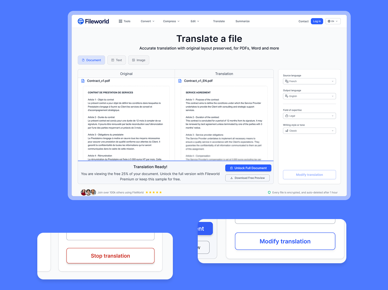
The "Paywall Shock". Users were hitting a hard paywall at the end of the process without seeing any value first. This created a sense of betrayal. Combined with an opaque translation process ("Black Box"), trust was non-existent, leading to immediate churn.
PROCESS
Hypothesis-Driven Design. I conducted a Heuristic Audit to spot severity issues, followed by Guerrilla Testing with 5 users to validate frictions.
Based on these insights, I defined key UX levers (Transparency, Control) and built a High-Fidelity Prototype to visualize the solution.
IMPACT
A Roadmap for Growth. Delivered a validated strategic vision.
The proposed "Freemium Teaser" model and "Unified Workbench" interface are projected to drastically reduce payment resistance and increase Free-to-Paid conversion by proving value upfront.
STRATEGIC AUDIT & VISION
Identifying friction points, defining UX levers, and prototyping high-impact solutions.
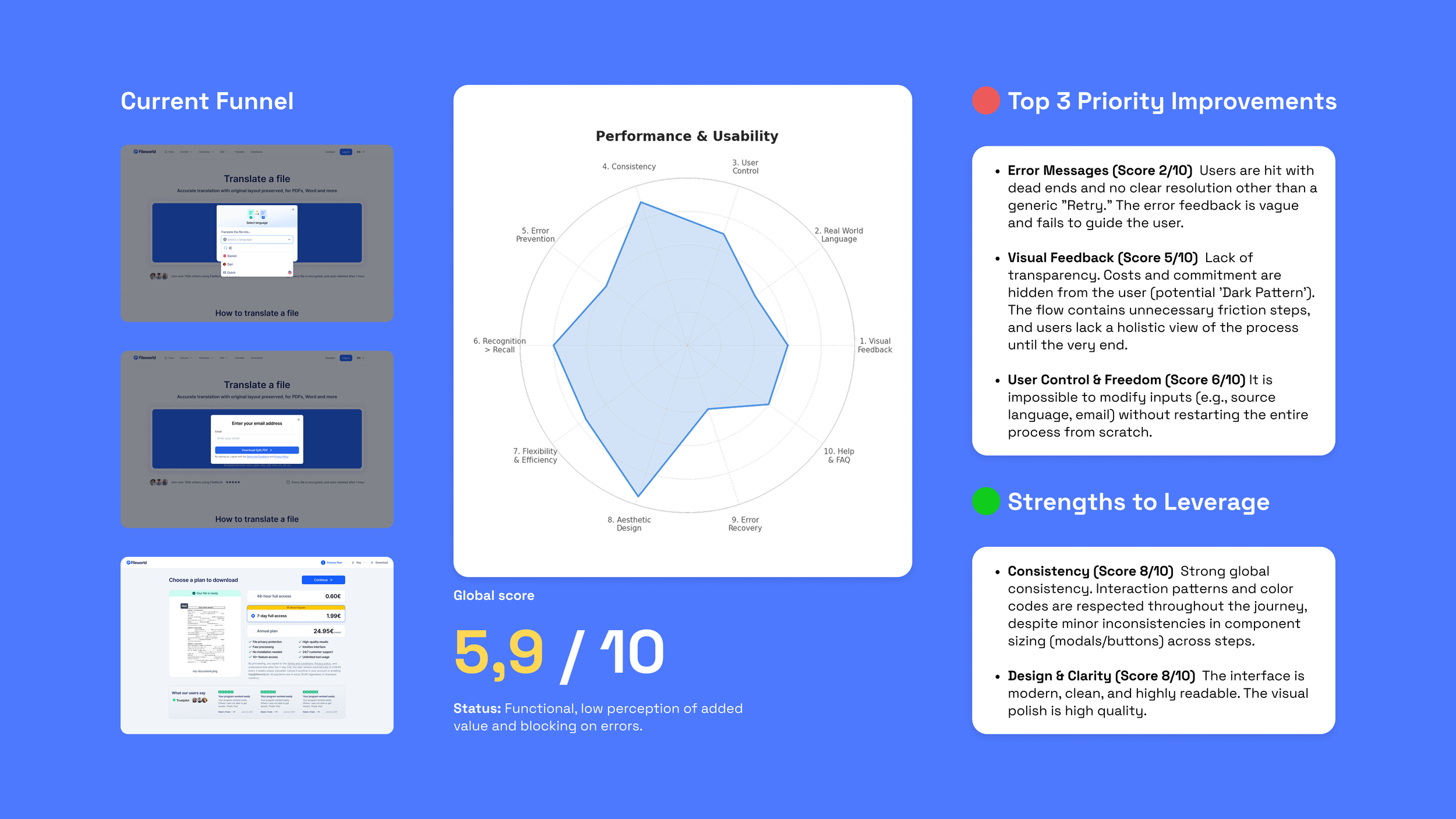
01. AUDIT & USER RESEARCH

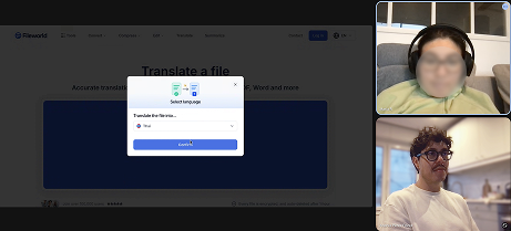
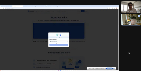
My audit revealed that the linear flow trapped users. If they made a mistake or need to translate in different languages, they had to start over.
Worse, the "Black Box" effect meant users had no way to verify quality before paying and the paywall at the end was unexpected.
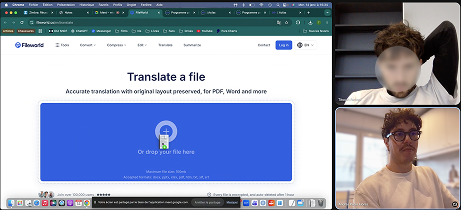
User Interviews
Methodology: Guerrilla Testing (5 Users). Based on Nielsen's Law: testing with just 5 users uncovers 85% of critical usability issues.
Profiles: Student, Employee, Entrepreneur.
“I would have liked the tool to suggest different translation options based on context, so I wouldn’t have to double-check everything myself.”
“It feels like a trap. I don’t know what I’m paying for.”
“Disappointing... it has all the signs of a freemium product, but then you realize monetization is forced without a free tier. It feels too aggressive.”
3
Major
Pain
Points
1. Paywall
"The Betrayal" The sudden appearance of the price at the very end, without any prior preview, is experienced as a betrayal by the user.
2. Trust
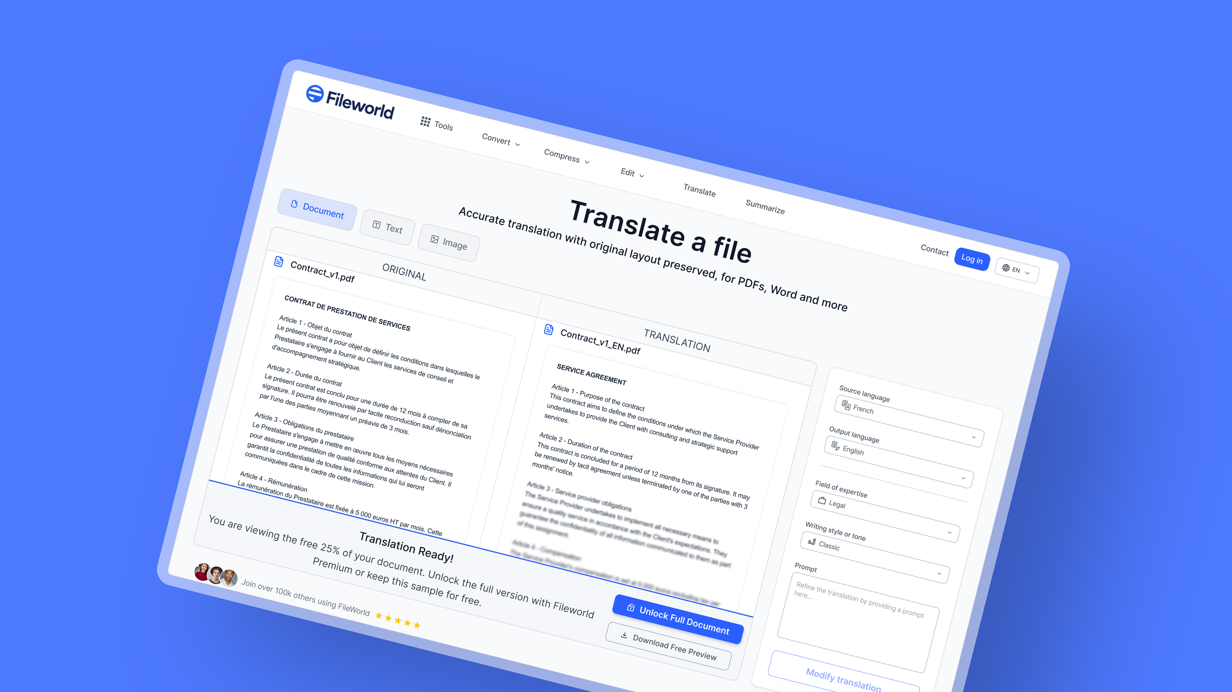
Lack of Transparency Users do not blindly trust the translator. They need to understand the mechanism or verify the quality of the result before committing to payment.
3. Rigidity
No Room for Error It is impossible to verify the source language or go back a step without restarting the entire process. Furthermore, the system lacks perceived value: the translation feels "binary" (word-for-word) and insufficient for complex texts.
02. THE STRATEGY

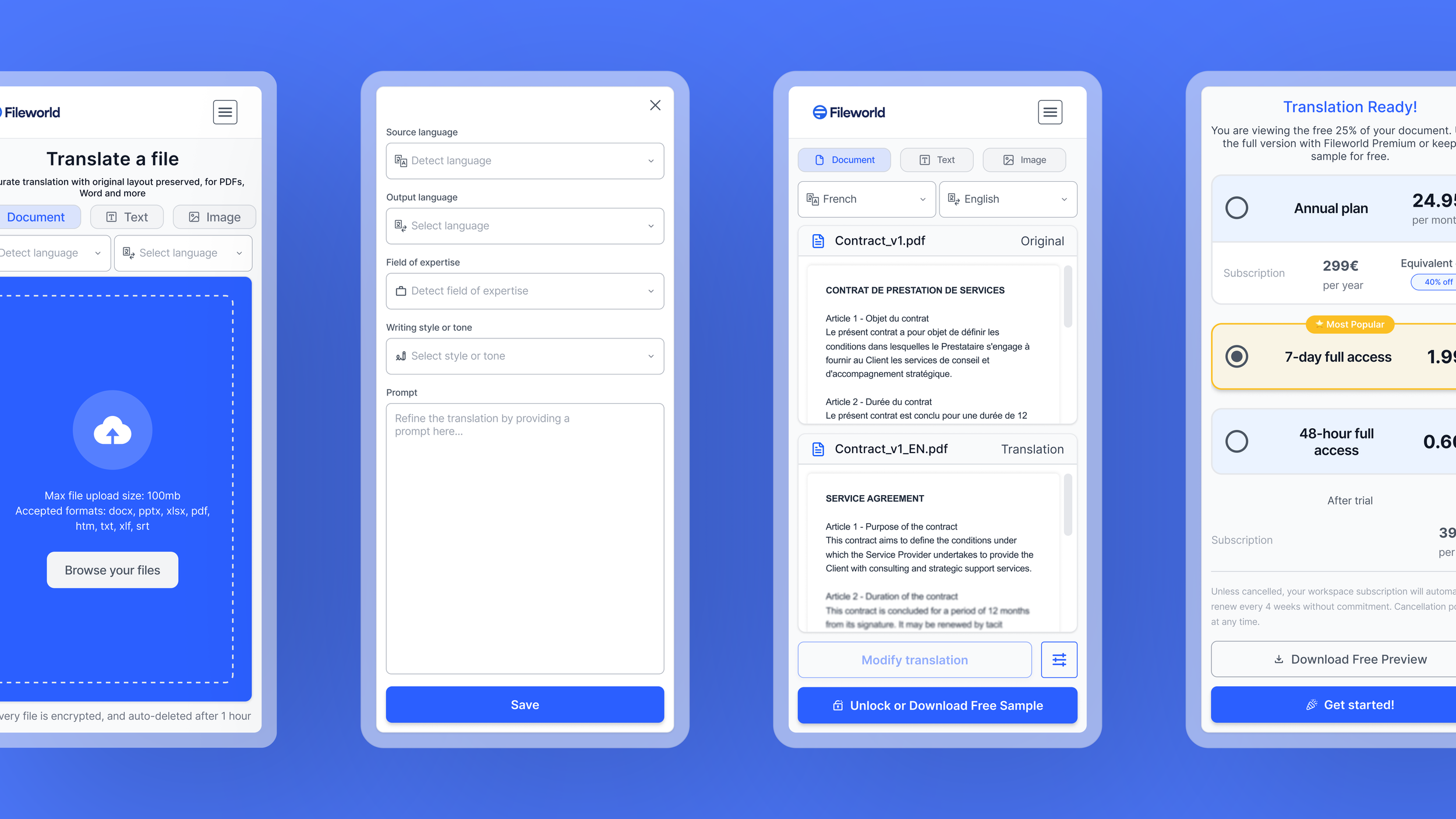
Paywall
Freemium & Result Preview
FROM FRUSTRATION TO VALUE
UX Lever: Reciprocity Principle (Cialdini) & Perceived Value
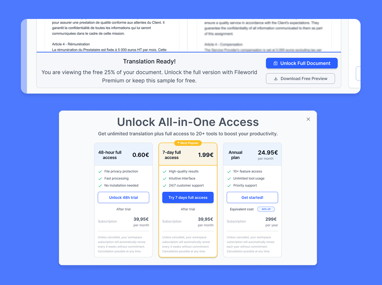
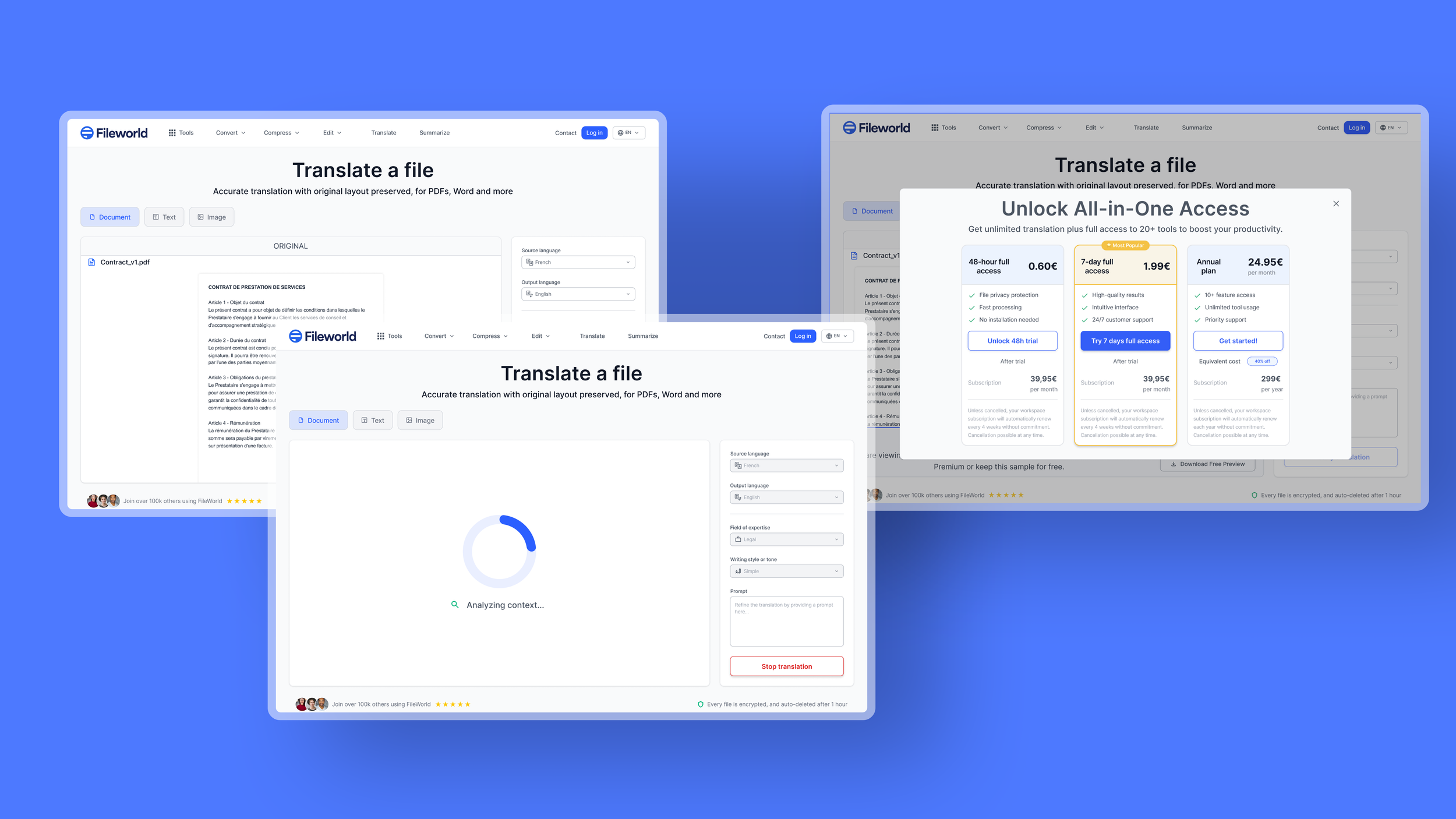
The Strategy: Offering the first 25% of the document for free creates a positive "psychological debt."
The Shift: Instead of blocking the user with a hard paywall (Frustration), we provide immediate value before asking for a commitment (Conversion).
The Bundle: To maximize conversion, the paywall doesn't just sell the file translation; it unlocks the entire "Fileworld Suite" (PDF, Sign, Edit), drastically increasing the perceived value of the subscription.
Trust
Expert Stance & Proof of Quality
FROM MISTRUST TO EXPERTISE
UX Lever: Authority Bias & Labor Illusion
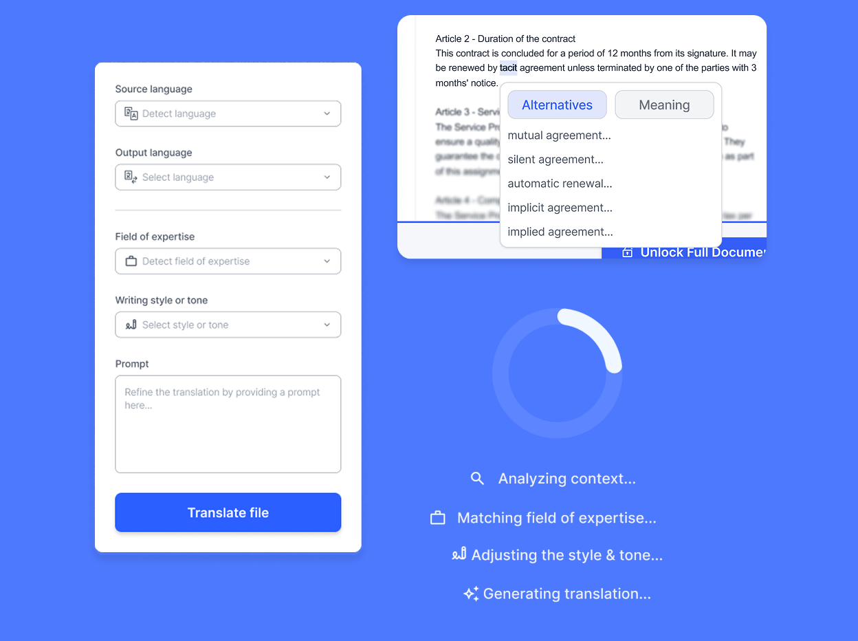
The Expert Stance: By integrating advanced parameters (Tone, Domain, Prompt) and allowing users to refine the output, the tool positions itself as a technical expert, activating the Authority Bias.
Showing the Work: Coupled with the Labor Illusion (visualizing the "thinking" steps: Analyzing context... Adjusting tone...) and a readable preview, we prove the quality of the result before payment, effectively removing doubts about reliability.
Rigidity
The Unified "Workbench" (Single Screen)
FROM RIGIDITY TO CONTROL
UX Lever: Heuristic #3 (User Control & Freedom)
The Solution: Transitioning from a rigid linear tunnel to a flexible, unified dashboard (The Workbench).
The Impact: The user retains total control. They can modify parameters (e.g., source language) without re-importing the document or restarting the flow. This freedom significantly reduces mental load and the anxiety of making errors.
OUTCOMES & LEARNINGS
Driving measurable impact through design clarity.
Conversion Strategy: Shifted from a "Paywall" model to a "Freemium Teaser" model to lower barriers.
Operational Efficiency: The single-screen interface eliminates loading times and unnecessary clicks.
Brand Perception: Elevated the product from a generic utility to a specialized, trustworthy tool belonging to a whole set of tools.
OUTCOMES
Transparency Converts: In SaaS and tools, hiding the process creates suspicion. Showing the "work" builds value.
Flexibility reduces Churn: Users abandon rigid flows. Giving them control (undo, edit) keeps them engaged.
The Power of Preview: You cannot sell a "blind" product. Proof of quality is the strongest conversion driver.